
Customer onboarding is a key contributor to finding success with mobile app development. Great customer onboarding not only lowers user abandonment rates but can also help encourage long-term success metrics like user retention and user lifetime value.
To increase user retention, mobile apps need to offer a seamless user experience, which involves design components, customer delight, and a great deal of value. This post describes the best practices for creating an effective user onboarding experience that will turn initial downloads into highly engaged users.
1. Build The Path of Least Resistance
Our previous blog article explains that user onboarding is about more than just welcoming new customers, instead, onboarding is about showing them around, pointing out how the most important things work, and setting them up for success. User onboarding needs to be as easy and intuitive as possible. User abandonment rates increase when critical features, login screens, and the overall navigation is too complex. Therefore, you want to build the path of least resistance.
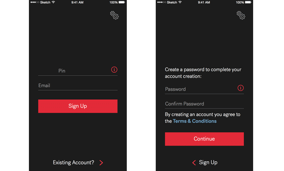
With user onboarding, it’s essential to minimize the user’s cognitive load. Cognitive load refers to the amount of brainpower required to use the mobile app. The human brain has a limited amount of processing power, and when an app provides too much information at once, it can potentially overwhelm the user making them abandon the task. Sometimes, this means a single login or sign-up screen. This is popular with social media and entertainment apps.

Source: useronboarding.com
Decluttering your mobile app’s onboarding interface is one effective way to reduce a product’s cognitive load. Every additional button, image, and icon makes the screen and the product’s user flow more complicated. It’s essential to eliminate anything that isn’t necessary for the mobile app’s onboarding sequence. It’s a best practice to keep content and interface elements to a minimum and only present the user with what they need to know to start using the product immediately. Always opt for a simple and intuitive design.
There are several types of onboarding sequences to choose from, and deciding on a suitable onboarding experience depends on both the utility of the app, and whether the concept of the app is new or familiar.
Benefits-oriented onboarding: This approach to mobile app onboarding communicates the value of the app. What does the app do? What value will the app provide the user? Slack keeps its mobile user onboarding concise when demonstrating the benefits that the product provides.
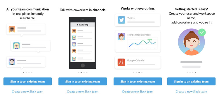
Source: Usability Geek
Function-oriented onboarding: With function-oriented mobile app onboarding you aren't demonstrating the benefits, but the key functionalities. This is when you highlight specific functionalities that show the user actions they can take, how the functionality is used, and when it should be used. Don’t add too many functionalities or it will look too complicated for the user. Include around three or four functionalities at the most.
Progressive onboarding: Progressive mobile app onboarding is focused on educating users through guided interactions. Users typically want to discover a mobile app on their terms. This onboarding process is interactive, providing the user with instructions as they use the app. If your app has an intricate workflow, multiple sections, hidden functionalities, and/or gesture-driven interactions, then progressive onboarding is a great approach.
Hybrid: A hybrid approach to mobile app onboarding is a combination of two or all of the above
Regardless of the most appropriate user onboarding method, the goal is to make it as easy as possible for users to begin using the app.
2. Reduce Sign-up/Log In Fields
Lengthy forms are a bad approach to user onboarding, especially on mobile where screen sizes are smaller. The ideal scenario is to allow users to sign up or log in using a single form, like a social media account. However, some apps will require more information, for example, a service-based app with a user base of existing customers.
In cases like these, you want to gather only the essential information. If that is a lot of information, consider breaking the process into more than one screen. Below is an example of an application for a large home services company that splits the sign-up process.
The overall goal is to minimize user input. For many people, typing on a small screen is an uncomfortable experience, and in many cases, it’s often error-prone, which adds to the frustration. Here are several best practices for simplifying sign-up and login fields:
- Provide input masks. Field masking is a technique that helps users format inputted text. A mask appears when a user selects a field and formats the text automatically as the user fills in the information. This technique helps users notice errors quickly.
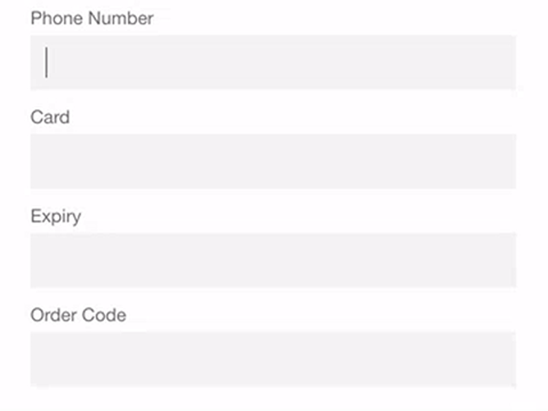
Source: Smashing Magazine
- Implement smart features like autocomplete. For example, filling out address fields can sometimes be problematic for users; however, using tools like autocomplete leverages geolocation and address prefilling allows the app to provide accurate suggestions based on the user’s exact location. This technique allows users to complete forms with fewer keystrokes than with static input fields.
- Dynamically validate field values. It’s extremely irritating to complete and submit a form to then return to the form and correct errors. Wherever possible, check field values immediately after entry so users can correct mistakes before submitting the form.
Source: Smashing Magazine
- Customize the keyboard for the type of query. For example, it’s helpful to display a numeric keyboard when the form requires a phone number and include the @ key when an email address is necessary. Ensure this feature is implemented consistently throughout the entire application, rather than only a few forms.
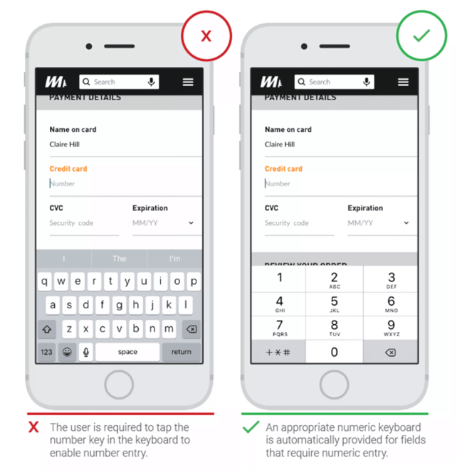
Source: Think With Google
3. Follow The “One Screen, One Concept” Rule
People can absorb information more easily if that information is precise and focused. Mobile application screens should condense information by using a single screen to describe a concept. This will avoid overloading the user with information.
This practice is particularly important for function-oriented and benefits-oriented mobile onboarding, where the purpose is to demonstrate core functionalities or communicate user value.
4. Give Feedback Quickly
Feedback serves multiple purposes in mobile app onboarding, most commonly to indicate errors or successes in the validation process. It can also be used through animations that act as positive reinforcement for completing interactions.
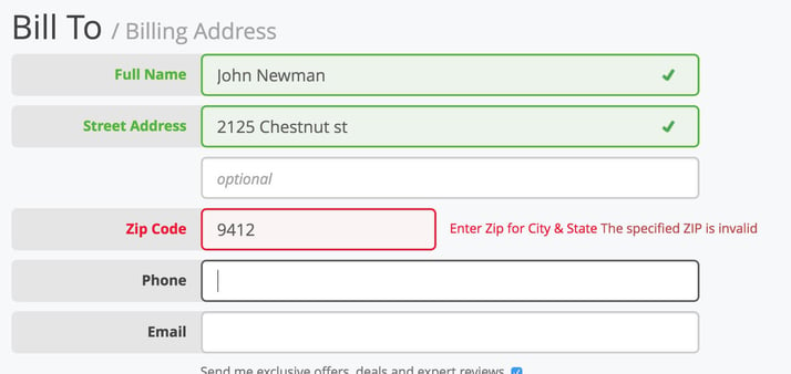
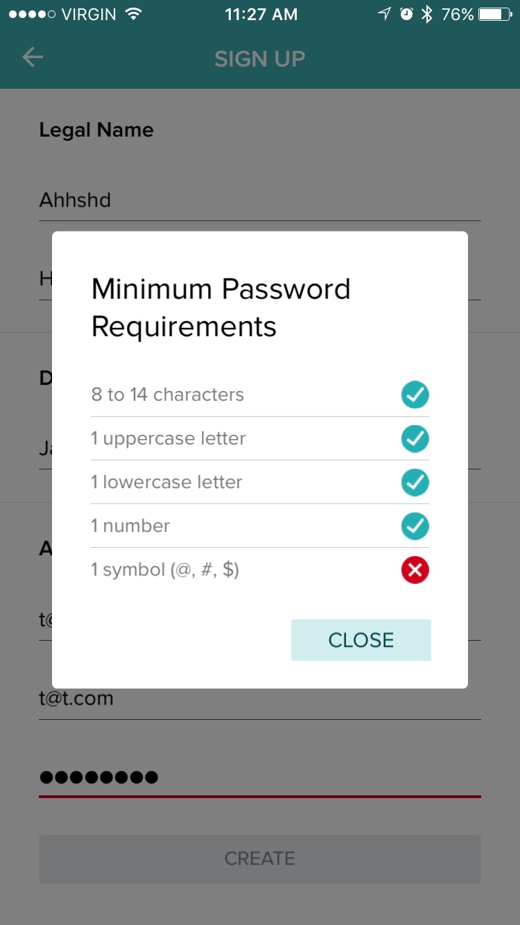
In the case below, the feedback indicates to the user that their password fails to meet the criteria, and makes it easy for the user to understand why. Error notifications should always be clear and contextual so the user knows what they’ve done wrong. This helps reduce failures and makes it easier for users to navigate the app.
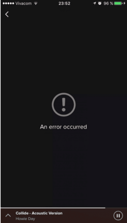
Whatever the cause, error handling has a huge impact on UX. Poor error handling paired with unclear error messages can also cause frustration and cause a user to abandon an app. In contrast to the example above, examine the error-state screen from Spotify below. This screen does nothing to convey context or reason and does nothing to help the user fix the problem.
You should never assume a user is tech-savvy enough to figure out errors. Always tell users what’s wrong in plain and concise language. Every error message should indicate:
- What went wrong and possibly why
- What steps the user should take to fix the problem
If you’re looking for more information, Smashing Magazine provides a helpful article on How to Design Error States for Mobile Apps.
5. Use Guided Interaction to Drive Progress
More complex mobile apps use progressive mobile onboarding, which functions as a guided tutorial of the product. The apps with the most successful progressive onboarding provide users with an element of fun in the discovery process without impeding the experience.
Guided interaction in mobile app onboarding is about engaging users in exploration, rather than telling them what to do. This concept is very popular in video games. Instead of lengthy tutorials, users play through the actions to become familiar with the controls and environment.
Guided interaction is also important for apps with empty states when users need to take a specific action to create content. Evernote, for example, requires users to add notes for the screens to populate. It also makes discovery an ongoing experience, with the “Explore Evernote” option available to users at any time.
6. Use Animation Purposefully
There are three reasons to use animations in a mobile onboarding experience:
- Draw attention to elements to help the user make progress
- Feedback – positive reinforcement for specific actions, for example
- Concept of space or presenting new content without the user feeling like they are “leaving a particular screen”
Using animation in mobile app onboarding should always be used with one of these purposes in mind and should be used sparingly. They should draw attention, but not irritate the user. Examples of good practice include subtle animations that show something is undiscovered or the use of pagination dots to show progress or load times.
7. Test, Test, & Test Again
Mobile app onboarding is first and foremost about the users. Listening to and acting upon user reviews and feedback can help you identify points of friction in your onboarding process and improve them. Once you have enough data to discern patterns, try new things and test to see if users love or hate them.
Breaking Down Your Retention Rate to Identify Problems
Consider breaking your retention rate down into three sections. Doing this will help you identify why your users aren't sticking with your app.
- Short-Term Retention (The first week of app usage)
Do users engage with the product more than once? If they aren't, they likely found it hard to use, or the mobile app onboarding process is confusing.
Onboarding is important for retaining users because if users don’t understand how and why they are using an app, they simply won’t end up using it.
- Mid-Term Retention (4 weeks of app usage)
Establish a pattern of usage. Are users moving through the mobile app properly? Identify any barriers in the user flow that prevent users from achieving their goals.
- Long-Term Retention (After one month of app usage)
Are your users relying on your app as a valuable, indispensable tool? How is it a part of their life?
One of the most effective ways to get users to rely on the product as an indispensable tool is simply to get them to use it more than once with a seamless mobile app onboarding process.
Convey Value Right Away
Are you demonstrating the value of your product right away? If the answer is "no", you need to reassess your mobile app onboarding process. A customer needs to understand the core value of your product immediately. By conveying value right away, users are far more likely to continue using the app for an extended period. When users aren't convinced that your app will make their life easier or provide them with considerable value, app uninstalls will skyrocket.
Effective user onboarding must convey value immediately. Onboarding helps users understand the value an app can provide to them by showcasing the app’s key features, and how those features work. It gives users a quick glimpse of the purpose of an app, to show them that the app is worth their time. You need to give users an excellent reason to stay, especially with heavy competition in the app market, housing products that have similar offerings. Onboarding is a great way to show them that reason right from the start.
Mobile app onboarding is imperative for activating users, encouraging engagement, and reducing abandonment rates.
Final Thoughts
The onboarding experience is something that needs to be given more attention if companies want to increase overall user retention. One of the biggest concerns for companies developing an app is retention rates. Acquisition and downloads are crucial, however, true mobile app success is measured by high retention rates because they show that users find continuous value in using your app. The user should be the center of all onboarding decisions so make sure you are collecting feedback and modifying your onboarding process to suit the needs of your users. Following these best practices will help you create a highly effective onboarding process that will not only drive user engagement but enhance the product’s overall UX design.
Like what you read. Learn more about Digital Analytics on our blog here.