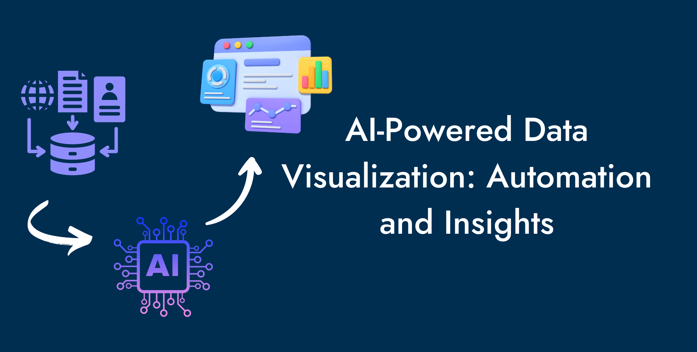
A picture is worth a thousand words. AI-powered data visualization is transforming how businesses and organizations engage with data.
AI introduces automation to data analysis and visualization, which enables organizations to process large amounts of data despite little in-house technical expertise.
No wonder the visualization, simulation, and rendering software segment of computer graphics stood at $ 680 million in 2020, and future predictions suggest a rise to $ 770 million in 2024.
Let us explain AI-powered data visualization and how data analysis and visualization automation offer actionable insights.
What is Data Visualization?
Representing data in the form of graphs, charts, maps, and other visual tools to understand the information better, identify trends, patterns, and outliers, and reveal insights is called data visualization.
Some of the most common visualization techniques include:
- Bar
- Graph
- Pie Chart
- Histogram
- Scatter Plot
- Map
- Heat Map
- Tree Map
- Word Cloud
Why Do We Visualize Data?
We visualize data to simplify and better comprehend info, communicate results, identify trends, patterns, and outliers, and help with decision-making.
With the advent of big data, organizations were able to collect large amounts of data and needed the right tools to perform data analysis.
The purpose was to identify useful information, trends, and patterns to make data-driven decisions.
As AI permeates various aspects of modern industry, tech, and business, it also transforms data visualization.
Let us explain how AI-powered data visualization affects our visualization capabilities.
How Does AI-Powered Data Visualization Work?
AI-powered data visualization processes data and represents it in appropriate visual forms to identify patterns and make decisions like conventional data visualization.
Its distinction lies in its ability to process large volumes of data in a limited time. Also, its ability to identify trends and patterns renders the sort of insights available not possible with traditional data visualization.
AI integrates automation into several processes that took data analysts considerable time.
The combination of machine learning facilitates the automatic selection of suitable visual representations like charts or graphs.
Besides saving time and resources, AI-powered data visualization offers insights and even explains data in human language, thanks to NLP.
Let us explore how AI-powered data visualization transforms data visualization via automation and insights.

If you have any queries about our analytics services, get in touch to let our team of highly professional experts take care of your concerns.
Auto Data Collection With AI
AI data collection enables businesses to collect massive data from various sources automatically.
AI-powered tools such as NLP and web scrapers quickly scan the internet, navigating websites to extract data.

With AI-powered data analysis tools, you can collect valuable information about user interactions and behaviors on your website and social media to find patterns and insights.
Automation enables organizations to achieve more in less time, freeing up space for other tasks requiring more human intervention.
Auto Data Cleaning and Preprocessing With AI
AI-powered data analysis and visualization tools ensure the accuracy of your data by auto-cleaning it for any noise or discrepancy.
Machine learning algorithms are trained on data to identify trends and patterns. When the input deviates from the identified patterns, AI detects an error and identifies the missing or incorrect values.

Besides saving time and effort, the automatic cleaning and preprocessing of your data boosts the credibility of your results and removes the chances of human error.
Some of the data cleaning and preprocessing services of AI-powered data visualization include:
- Remove noise
- Identify missing data
- Identify anomalies and outliers
- Identify and correct errors
- Convert to standard format
Auto Data Visualization With AI
Finally, AI-powered data visualization automatically selects the type of chart or map, down to colors, style, and labels, most suitable for the data.
A combination of AI, ML, and other tools come together to train these tools. So, they identify the visual representation a human would choose for a particular analysis or set of data.

A great thing about this automation is that AI-powered data analysis and visualization tools can spot the trends and patterns a human eye could miss.
It improves our understanding of the data, offers better insights, and establishes baselines for patterns associated with your data to identify and quickly act against possible issues.
Businesses with steady data streams can also employ AI data visualization for real-time visualization for quick insights and data-driven decision-making capabilities.
Interactive Dashboards
One of the purposes of using data visualization is to tell a story about your business in the form of an infographic image.
Conventional data visualization tools like Google Looker Studio allow users to create interactive dashboards.
AI-powered data visualization tools allow you to achieve the same with a cleverly written prompt in natural language. The speed and ease afforded by AI are the best things on offer here.
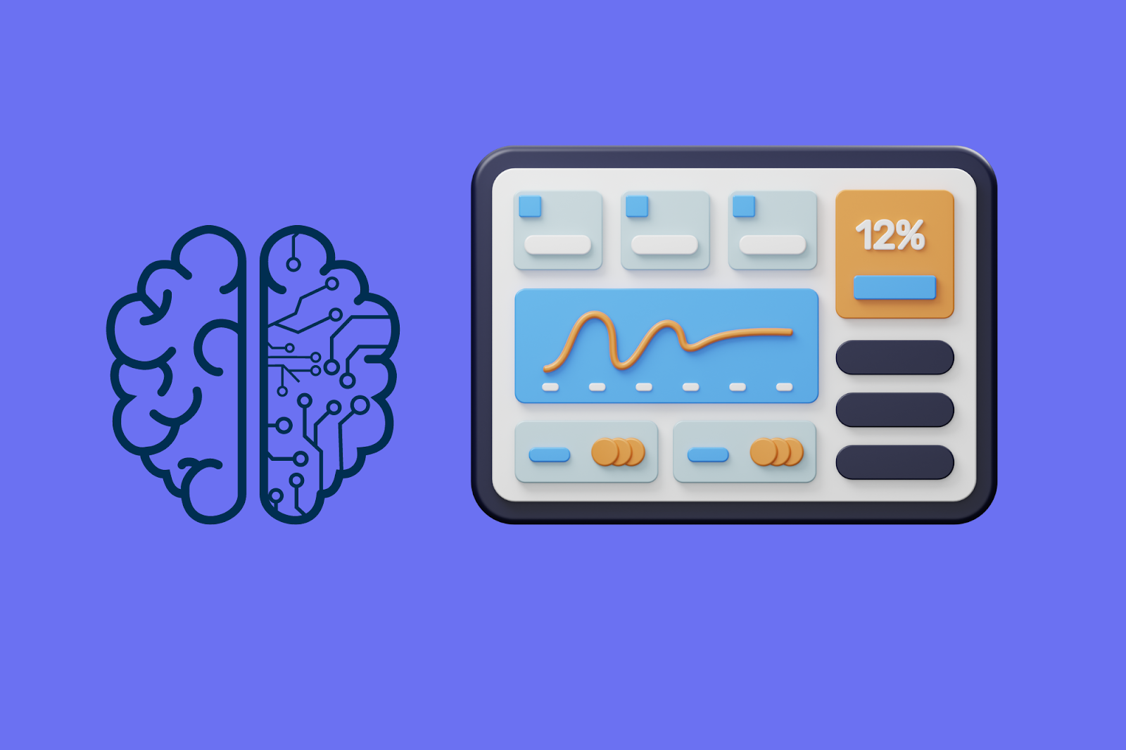
You still have control to customize these dashboards to personalize these interactive dashboards to suit the unique needs of your business.
The interactive part means that users can look at the data from different angles with drop-down menus, filters, and other interactive capabilities to dig deeper into the data.
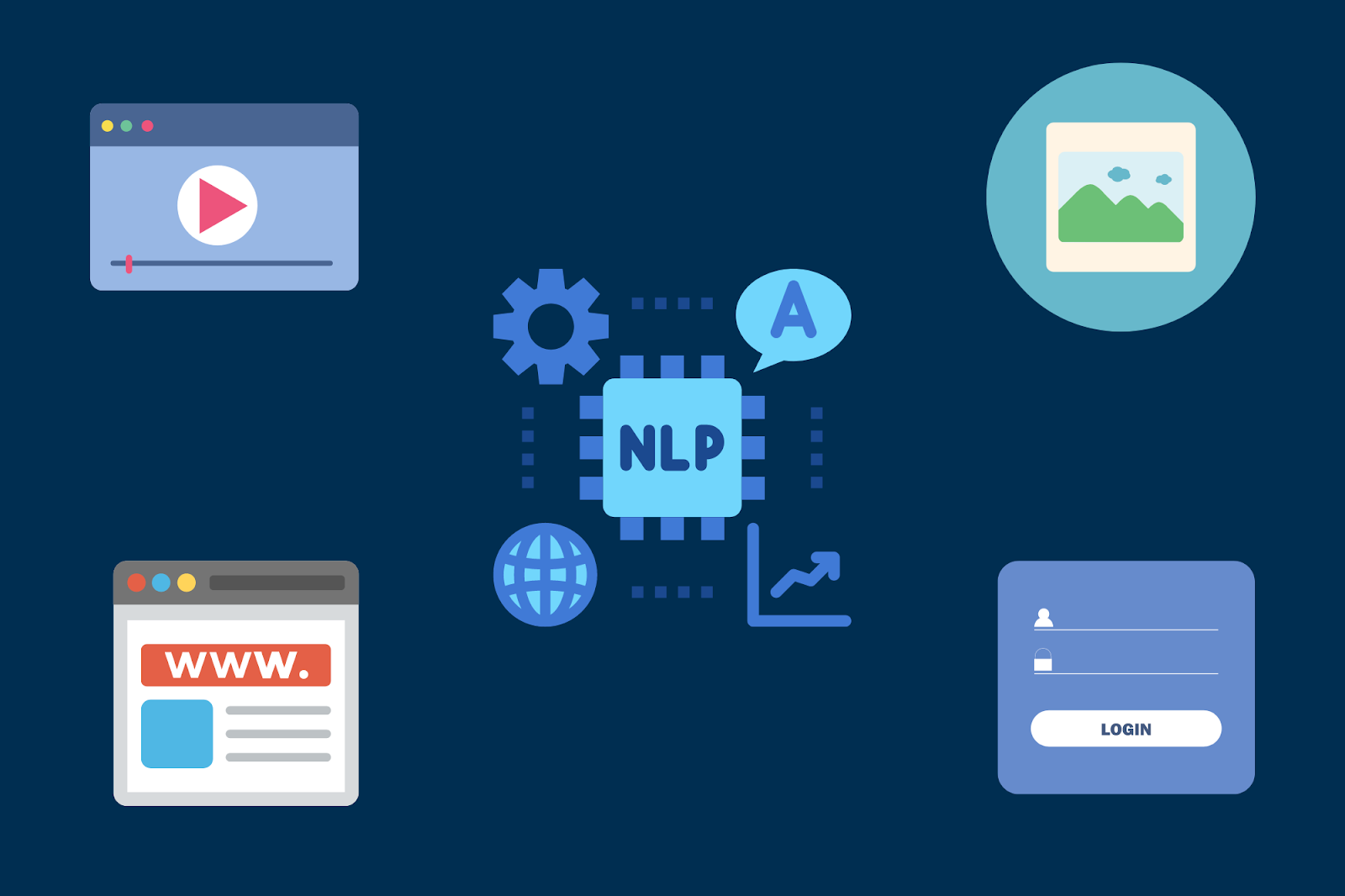
Natural Language Processing
NLP is a branch of artificial intelligence that uses computational linguistics with statistics, machine learning, and deep learning models to help computers understand human language.
AI-powered data visualization tools put this technique to use to do the following:
- Extract data from images and videos
- Perform sentiment analysis
- Topic modeling
- Summarizing text
- Respond to user queries in human language
We mentioned how AI-powered data analysis and visualization tools can automatically collect data from various sources.
NLP allows these tools to extract the data by performing picture and video analysis. It also helps to understand the emotions expressed in these media via sentiment analysis.
These analyses help businesses understand user perception of their products or services on social media.
Several AI-powered data analysis and visualization tools allow users to type queries and receive a response in human language.
Users can also use human language prompts to ask these tools to automatically generate data visualization, offering in-depth insights into data without much technical expertise.
Predictive Analytics
Predictive analytics uses historical data to predict the future by processing this data using machine learning, statistical models, and data mining.
With AI, predictive analytics is no longer dependent on human interaction. It makes up for that with automation.

ML tackles its sensitivity to unexpected data and limited data variations by training the predictive model on the existing data. It learns and adapts on the go, offering more accurate visualizations and reliable projections.
With predictive analytics, AI-powered data visualization can incorporate forecasts about product demand, resource allocation, and inventory management.
Using visual models to represent these predictions helps organizations identify and grasp what matters, but doing so is technical and complicated without AI data visualization.
Visualizing analytical and predictive data via AI-powered data visualization helps organizations get actionable insights.
Eventually, this will help them to streamline their processes, foresee campaign response, reduce risk, and fine-tune their marketing efforts.
Business Intelligence
Business intelligence uses software capabilities to analyze businesses’ past and present data to offer actionable insights such as dashboards and visualizations.
BI analyzes the performance of a business, asks diagnostic questions, and identifies performance gaps.
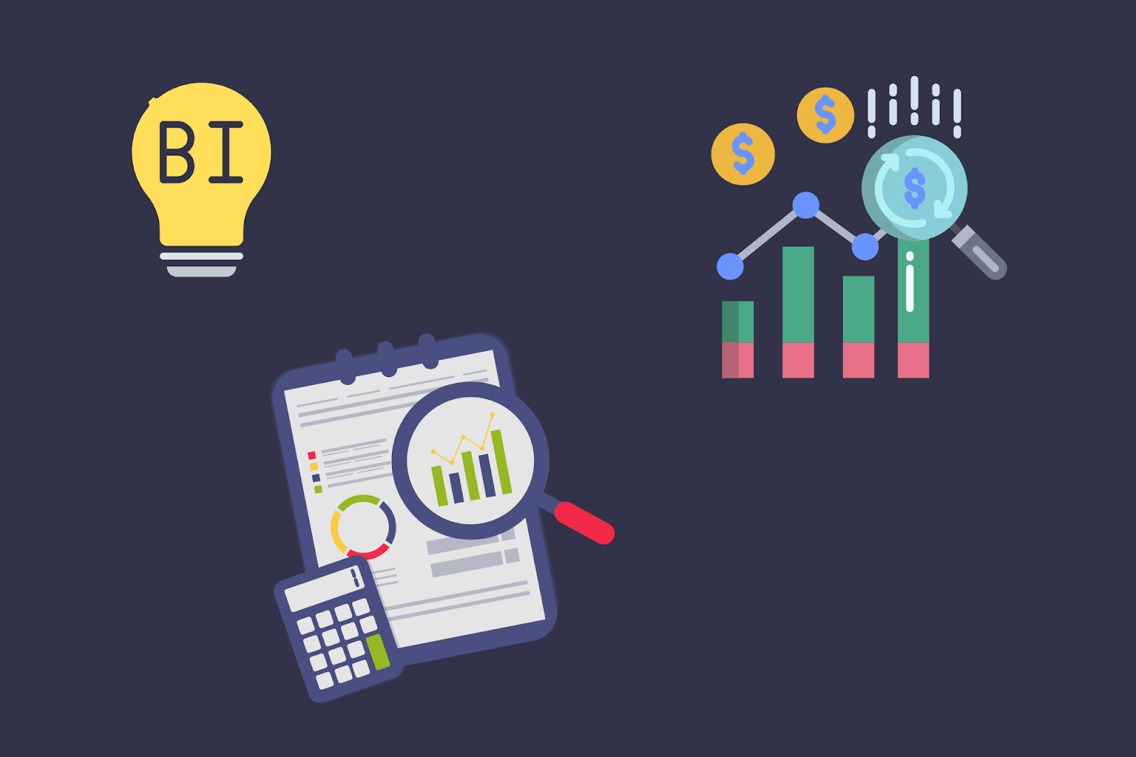
Common uses for BI include:
- Gain insights into the business’ performance
- Understand customer experience
- Optimize return on investment
Integrating AI and ML in business intelligence tools allows people with limited software capability to gain insights into their business data with easy-to-understand data visualizations and BI reports.
Combine these capabilities with NLP, and they can ask their queries in natural language to find either automated data visualization or a report in response.
Examples of AI-Powered Data Visualization Tools
Let us discuss some data visualization tools that rope in generative AI (GenAI) to enable automation and insights in data analysis and visualization.
Tableau
Tableau is a popular data visualization tool that integrates generative AI into its platform to help users of various backgrounds and expertise benefit from data analysis and visualization.
Tableau’s AI-powered data visualization capabilities include the following:
- Ask data - allows users to ask questions in natural language and get responses like insights, reports, and dashboard recommendations.
- Explain data - offers automatic analyses to identify underlying relationships, outliers, and correlations in the data visualization.
- Data stories - add autogenerated explanations for data points in the form of bullets on the dashboard.
- Einstein discovery - Tableau's AI helper Einstein and trendline predictions also provide valuable insights.
Microsoft Power BI
Microsoft Power BI is a business intelligence tool to collect data from various sources to offer data analysis, visualization, and insights.
- Microsoft Copilot - it integrates into Microsoft 365 products, including Excel. Trained on large language models (LLM), copilot allows users to automatically arrange, analyze, and visualize data, summarize, identify trends, and offer insights.
- Power BI Q & A - allows users to generate visuals automatically by letting them type their queries, facilitate with autocomplete, or suggest questions and answer with a visualization.
- Key Influencers - analyzes data, ranks factors, and displays them as visuals to show what influences your key performing indicators (KPIs).
- Decomposition Tree - offers a decomposition tree visual, breaking down hierarchical data into components for ad hoc analysis and understanding what makes up a value.
- Smart Narrative - offers users automatic explanations for their data analysis in natural language.
Sisense
Sisense is a business intelligence platform with AI data analysis and visualization capabilities. Suitable for organizations of all sizes, it facilitates analytics and BI abilities at scale.
- Fusion Embed - offers AI-powered capacity for embedded analytics, which is the ability to embed low code or no code analytics into the product or service.
- AI-Exploration Paths - automatically generates visualizations and offers insights in the context of the data model used for the dashboard.
- Simply Ask - lets users ask questions in human language, thanks to natural language query (NLQ), and get a widget in response.
- Sisense Infusion Apps - allows users to ask questions in natural language and get insights in response in work tools like Google Sheets, Google Slides, Slack, MS Office 365, and Teams.
Conclusion
Data visualization represents data in charts, graphs, and maps to identify trends and patterns and gain insights.
AI-powered data visualization automates several stages of data analysis and visualization, allowing for quickly analyzing large amounts of data in little time.
In so doing it offers actionable insights for data that was otherwise hard to get by and would have taken someone with a lot more technical abilities.
AI-powered data visualization involves automation for several stages of data analysis and visualization.
AI and natural language processing come together to collect data from various sources, including websites, social media, images, and video.
AI and ML help the AI-powered data analysis and visualization tools to identify patterns for data. It enables these tools to identify and fix any errors, missing data, or outliers in the data and preprocess it for analysis.
AI, ML, and other tools facilitate auto-analyzing the data and auto-visualizing the results.
Machine learning helps those tools replicate human behavior for representing the data in appropriate forms of charts, graphs, maps, and interactive dashboards.
NLP enables AI-powered data analysis and visualization tools to allow users to communicate via natural language.
So, individuals with limited technical capabilities write prompts to ask these tools to perform analyses and then represent them with desired visual tools.
The integration of predictive analytics allows these tools to use historical data to make useful future predictions, such as product demand and inventory management.
Business intelligence capabilities of AI-powered data visualization allow businesses to gain insights into their historical and current data via graphical representations and reports.
Finally, the blog discusses some examples of AI-powered data visualization tools (Tableau, Microsoft BI, and Sisense) and their GenAI features.
Do you like what you read? Learn more about Digital Analytics on our blog here.